
Creating an impactful poster requires more than eye-catching colors and images—it relies heavily on typography. The fonts you choose and how you pair them can make or break your poster design. Effective font pairing enhances readability, establishes hierarchy, and conveys the right mood or message to your audience. By strategically combining a poster font, designers can create posters that are not only visually appealing but also communicate information clearly and effectively.
Principles of Effective Font Pairing
Contrast: Choose fonts that have distinct differences—such as a bold sans-serif for headings paired with a clean serif for body text. Contrast draws attention to key elements while keeping the layout readable.
Complementarity: While contrast is important, fonts should also feel compatible. Look for similarities in weight, style, or proportions to maintain cohesion.
Hierarchy: Pair fonts to create a visual hierarchy that guides the viewer’s eye from headlines to subheadings and body text. This ensures that the most critical information stands out.
See also: How AI Face Swap Technology Works Behind the Scenes
Choosing Fonts for Posters
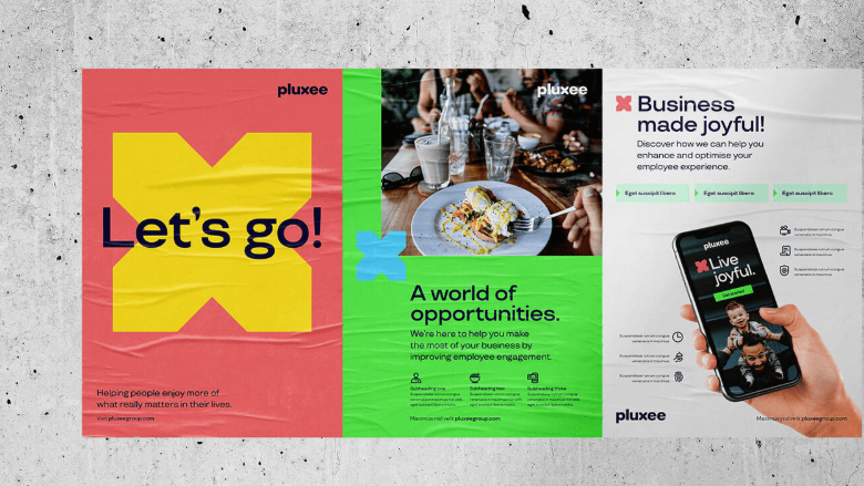
Display Fonts for Headlines
Posters often rely on strong headlines to grab attention. Display fonts are ideal for this purpose because they are bold, unique, and visually striking. They can convey personality and tone—from playful and energetic to elegant and sophisticated. Use display fonts sparingly for maximum impact.
Readable Fonts for Body Text
For secondary information like dates, addresses, or additional details, readability is key. Clean sans-serif or serif fonts work well for body text, ensuring that your message is clear even from a distance.
Pairing Examples
- Sans-Serif + Serif: A geometric sans-serif headline paired with a traditional serif body font creates a modern yet balanced look.
- Bold + Light: Using a heavy, bold font for the headline and a lighter weight for subtext emphasizes hierarchy while maintaining clarity.
- Script + Sans-Serif: A decorative script headline combined with a simple sans-serif for supporting text can add elegance without sacrificing readability.
Practical Tips for Pairing Fonts on Posters
Stick to Two or Three Fonts
Overloading a poster with multiple fonts can confuse viewers. Limit your design to two or three fonts, using one for headlines, one for subheadings, and optionally one for body text or call-to-action elements.
Consider the Tone and Message
Your font choices should align with the poster’s purpose. A music festival poster might benefit from playful, bold fonts, while a corporate seminar poster should lean toward clean, professional typefaces.
Test Sizes and Spacing
Posters are often viewed from different distances, so test your font sizes to ensure readability. Adjust kerning (letter spacing) and leading (line spacing) for clarity and balance.
Use Color to Enhance Font Pairing
Color can complement font choices by creating emphasis or separating sections. Contrasting colors for headings and body text can enhance readability and draw attention to key details.
Maintain Visual Balance
Ensure that fonts do not overpower images or other design elements. The combination of fonts, colors, and graphics should create a harmonious layout that guides the viewer’s eye naturally.
Conclusion
Pairing fonts effectively is an essential skill for creating compelling poster layouts. By selecting complementary fonts that provide contrast, readability, and hierarchy, designers can craft posters that communicate clearly while making a visual impact. Limiting the number of fonts, considering the tone of the message, and testing sizes and spacing all contribute to a polished and professional design. Proper font pairing not only improves aesthetics but also ensures that your poster’s message is engaging, accessible, and memorable.